The Design:
It is clear to most that our logo represents an "S" for both Simple and Switch, but did you know the design was created to represent the decision to change your purchasing decision? The upper half of the S is empty, reflecting the less intentional and less fulfilling decisions to buy from mediocre or harmful companies. The lower half of the S is shaded, showing the transition to purchasing that carries more weight and impact, buying that is more "full."

Our colors were also very intentional. We had lots of people telling us to choose green to represent sustainability, which made a lot of sense! However, after some research on consumers subconscious reactions to color, we found out green is mostly associated with wealth. Instead, we chose to use blue, which is associated with building trust and relationships. Later we added a shade of yellow/orange. Yellow is said to give the viewer a feeling of optimism, while orange provokes a call to action. It's important to us that our company be a call to action for consumers, while promoting optimism over shame, fear or guilt, so this combination of colors was perfect.
The Artist:
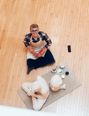
As an early stage business one of our favorite things we've been able to do is collaborate with self starters, artists, technicians and dreamers about ways to make this company better. One of our earliest partnerships was with Justin Kedl, a talented sculptor and graphic designer out of Gordon College. Of the experience, Justin says, "I spent a lot of time drawing various “S” shapes in my sketchbook, and somewhere along the line I ended up drawing the first iteration of what is now the logo. It, very accidentally, already represented many aspects of the company: the idea of moving into purchasing that carries more impact, the image of a dollar sign, and the image of a percentage sign. After a few more iterations with Rachel and some tweaking of color schemes, everything fell into place.

More Fun History:
Did you know Simple Switch was originally going to be called "Buy Better?" This decision took a long time, and one of the big factors that helped us finally make the decision was that we needed to choose so that Justin could start the logo!
Here are some early designs that we didn't end up going with, based on things like sustainability imagery, the idea of "positive" purchasing, etc.


